Overview
Toast is a React Native component designed to provide quick feedback in the form of a temporary, dismissible message. It can be customized based on various variants such as default, success, destructive, and info.
Preview
- Preview
- Code
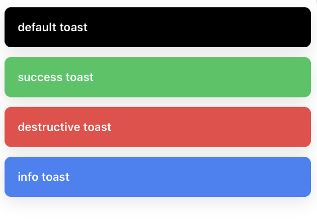
Light Mode
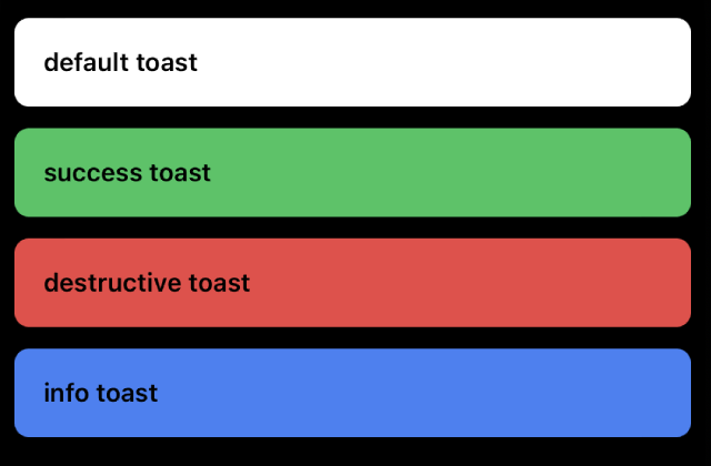
Dark Mode
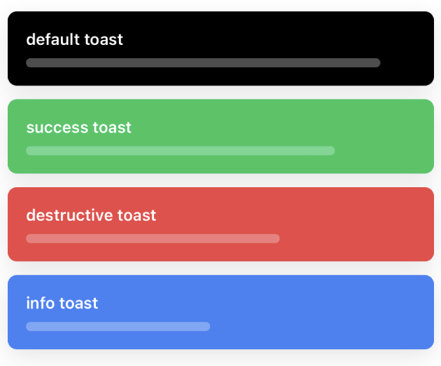
Light Mode (with progress)
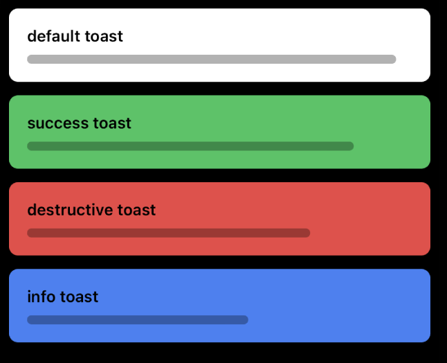
Dark Mode (with progress)
Installation
- CLI
- Manual