Overview
Select is a customizable React Native component for selecting options from a dropdown.
This component converts any array of objects into an array of options compatible with the label and value fields, facilitating use with different data sources.
Preview
- Preview
- Code
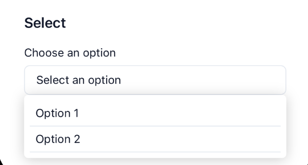
Light mode
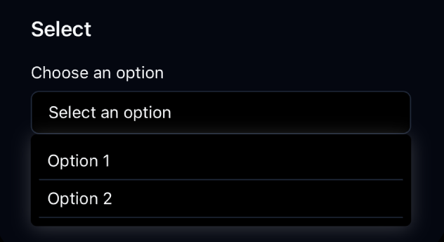
Dark mode
Installation
- CLI
- Manual
Properties
-
label?: string(optional) - Text displayed as selector label. -
labelClasses?: string(optional) - Style classes for the label. -
selectClasses?: string(optional) - Style classes for the selector button. -
options: any[](required) - Array of options that will be converted into options compatible withlabelandvalue. -
onSelect: (value: string | number) => void(required) - Callback function called when an option is selected. -
selectedValue?: string | number(optional) - Currently selected value. -
placeholder?: string(optional) - Placeholder to display when nothing is selected (default: ‘Select an option’). -
labelKey: string(required) - Label key in the options object. -
valueKey: string(required) - Value key in the options object.