Overview
Checkbox is a React Native component designed for creating interactive checkboxes with customizable styles. This component allows for easy integration into forms and user interfaces, offering properties for label display and style customization. It leverages Tailwind CSS classes to provide a flexible styling approach suitable for both light and dark themes.
Preview
- Preview
- Code
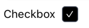
Light mode (Enabled)
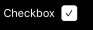
Dark mode (Enabled)

Light mode (Disabled)
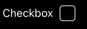
Dark mode (Disabled)
Installation
- CLI
- Manual
Properties
label?: string(optional) - The label text displayed next to the checkbox.labelClasses?: string(optional) - Custom classes for styling the label.checkboxClasses?: string(optional) - Custom classes for styling the checkbox.className?: string(optional) - Custom classes for the container wrapping the checkbox and its label.