Overview
Dialog component in React Native is designed to manage modal dialogs within your application. The
component is split into three key parts: Dialog, which acts as the context provider; DialogTrigger,
which handles the action to open the dialog; and DialogContent, which contains the actual content to
be displayed in the dialog.
Preview
- Preview
- Code
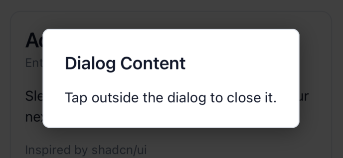
Light mode
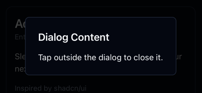
Dark mode
Installation
- CLI
- Manual
Properties
Dialog
This component doesn’t accept any props directly but acts as a context provider for dialog visibility.
DialogTrigger
children: The React element that will trigger the dialog to open. It should be a component that accepts anonPressprop, like a button.
DialogContent
children: The content that will be displayed inside the dialog. This can be any React Node.
Usage
To use the Dialog component, wrap your entire dialog structure withDialog. Then, use DialogTrigger to specify the element that will open the dialog, and DialogContent to define the content of the dialog.