Overview
Progress Displays an indicator showing the completion progress of a task, typically displayed as a progress bar.
Preview
- Preview
- Code
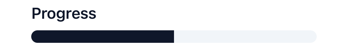
Light mode
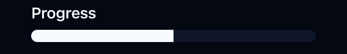
Dark mode
Installation
- CLI
- Manual
Properties
className?: string(optional) - The classes for theViewbar.value: number- The value of the progress bar. It should be a number between 0 and 100.