Overview
A set of layered sections of content —known as tab panels— that are displayed one at a time.Preview
- Preview
- Code
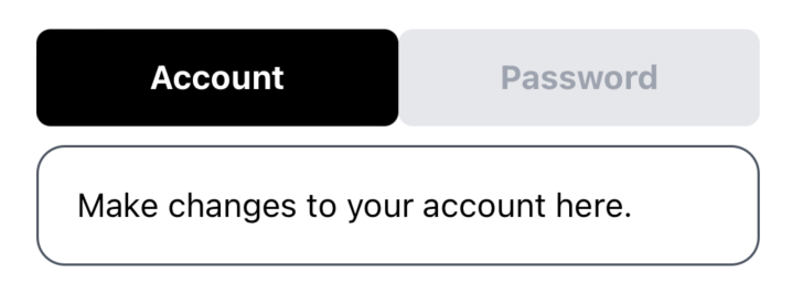
Light mode

Dark mode
Installation
- CLI
- Manual
Components
Tabs
The parent container for the tabbing system.defaultValue: string- The value of the tab that should be active when initially rendered.children- Components to be rendered inside the Tabs container. MainlyTabsListandTabsContent.
TabsList
The container for individual tab triggers.children-TabsTriggercomponents.
TabsTrigger
Triggers or buttons for each tab. Should be placed insideTabsList.
id: string- A unique identifier for the tab.title: string- The label displayed on the tab trigger.
TabsContent
Container for the content of each tab.value: string- A unique value that associates the content with a trigger.children- The content to display when the tab is active.