Overview
DropDown component in React Native is designed to manage drop-downs within your application. The component is split into 6 key parts: DropDown, which acts as the context provider containing the other 5 parts; DropDownTrigger, handles the action to open and close the dropdown; DropDownLabel, this is used to label a section in the dropdown menu; DropDownContent, this contains the actual content to be displayed in the dropdown menu; DropDownItemSeparator the separator is used to visually separate items in the dropdown menu; DropDownItem this component contains the dropdown item to be displayed in the dropdown menu.
Preview
- Preview
- Code
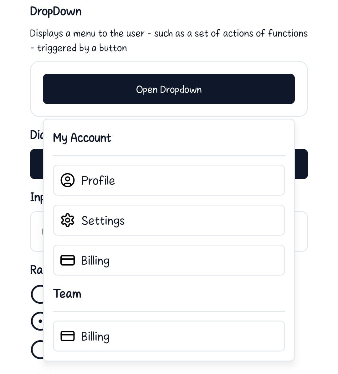
Light mode
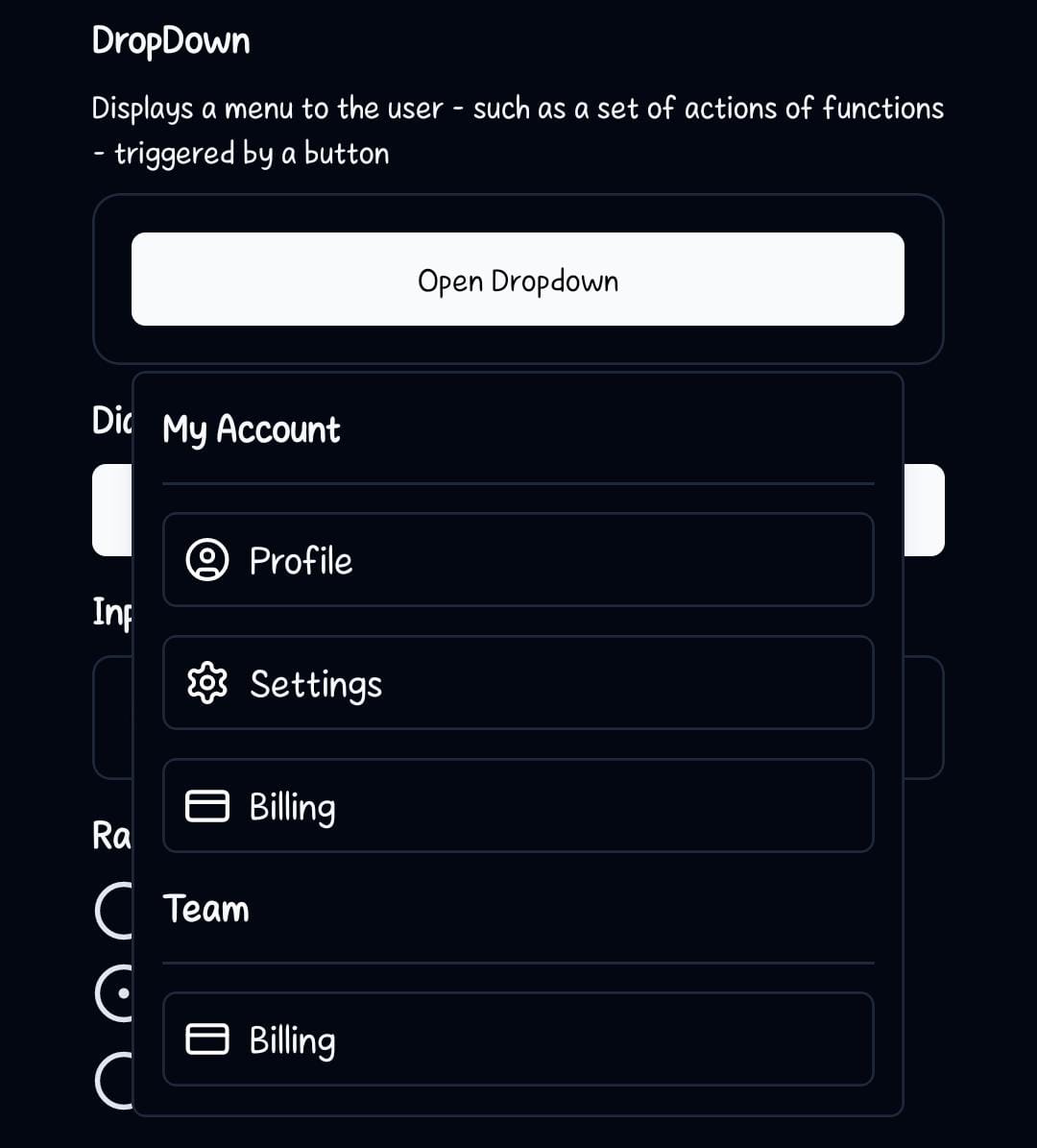
Dark mode
Installation
- CLI
- Manual
Components
DropDown
This component is the parent container for the dropdown system.children- These are the components to be rendered inside the DropDown view. MainlyDropDownTrigger,DropDownLabel,DropDownContent,DropDownItemSeparatorandDropDownItem.
DropDownTrigger
This component handles the action to open and close the dropdown.children: The react element that will trigger the dialog to open. It should be a component that accepts anonPressprop like a button.
DropDownContent
This is the body of the DropDown Menu.children- Components to be rendered inside theViewelement.className?: string- Tailwind CSS classes to be applied to theView
DropDownLabel
This component accepts thelabelTitle prop that contains the name/title as the main text shown in the header.
labelTitle- Text to be rendered inside theDropDownLabel.
DropDownItemSeparator
This is a line approximately to the hairLineWidth that will be used to separate different sections in the dropdown menuDropDownItem
This component contains the item content that will be added to the dropdown menu.children- Components to be rendered inside theViewelement.className?: string- Tailwind CSS classes to be applied to theView
Usage
Basic Usage
To use the DropDown component, wrap your entire dropdown structure withDropDown. Then, use DropDownTrigger to specify the element that will open the dropdown, and the DropDownContent will now appear when you press on the DropDownTrigger. The DropDownContent will contain the content of the dropdown ie. DropDownLabel, DropDownItem and DropDownItemSeparator.