Overview
Button is a React Native component designed for creating styled buttons. It provides quick style
customization through the variant and size props, automatically adapting to the device’s current
color scheme. Control style using Tailwind CSS classes through the className and labelClasses props.
Preview
- Preview
- Code
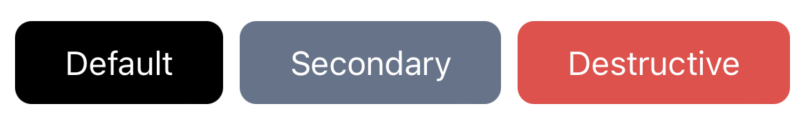
Light mode

Dark mode
Installation
- CLI
- Manual
Properties
label: string(required) - The label displayed on the button.labelClasses?: string (optional)- The classes for the button’s text.className?: string (optional)- The classes for the parent container.variant?: Variant(optional) - The variant of the button. Can be one of ‘default’, ‘secondary’, ‘ghost’, ‘destructive’, or ‘link’.size?: Variant(optional) - The size of the button. Can be one of ‘default’, ‘sm’, or ‘lg’.
Note: The variant property determines the background color of the button. The color scheme (light/dark mode) is automatically detected.