Why Nativecn UI?
- Beautifully Designed: Components are designed with a focus on aesthetics, delivering a great UI/UX.
- Customizable: Modify components easily using Tailwind CSS classes —no
styleneeded. - Easy Integration: Import components into your project as needed. No package installs.
- TypeScript-first: Static typing for all components.
Installation
Set up [NativeWind](https://www.nativewind.dev/quick-starts/expo)
NativeWind allows you to style components using Tailwind CSS classes.Finally, add
"nativewind/babel" to your babel.config.js file.3. Add nativecn-ui components
Run the CLI to initialize your project and add components easily:Or simply copy-paste from the components directory.
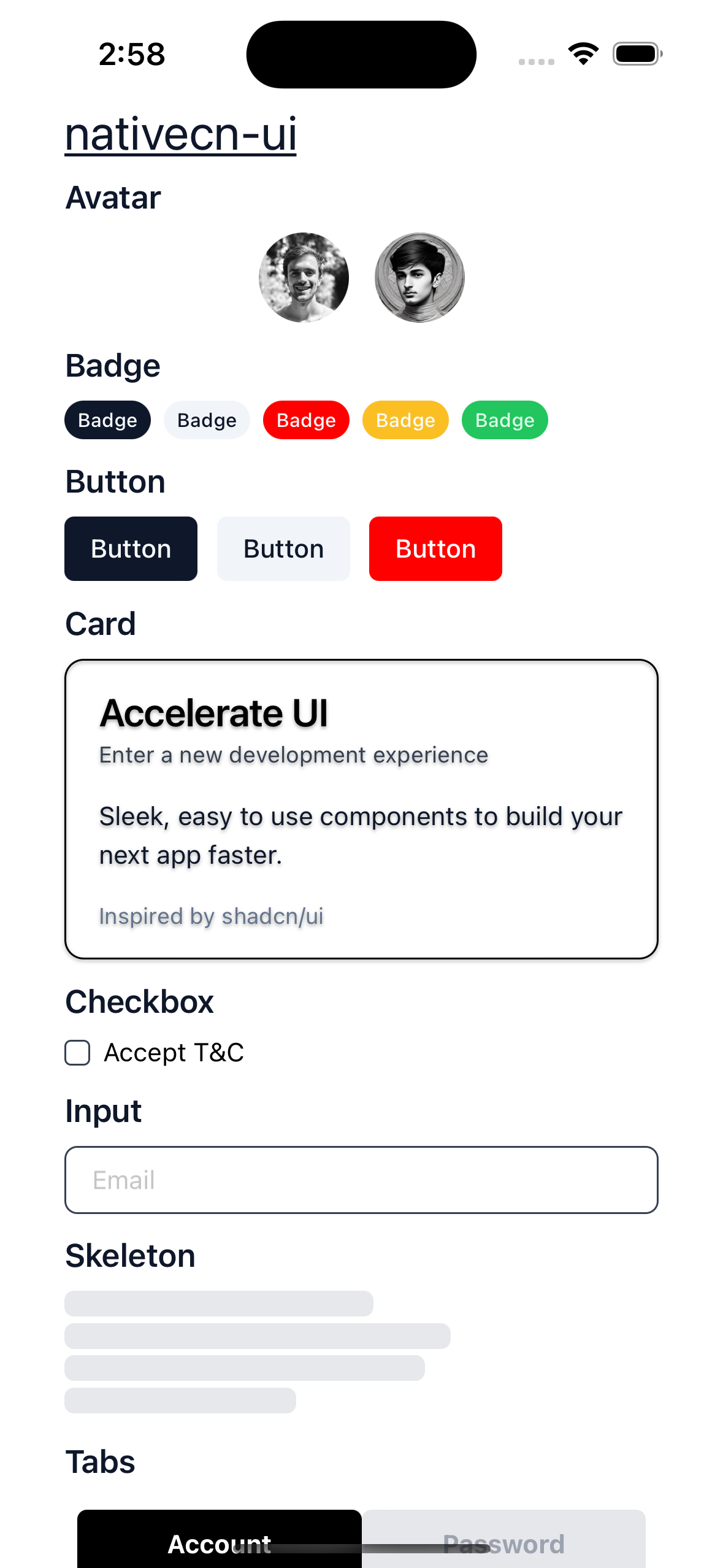
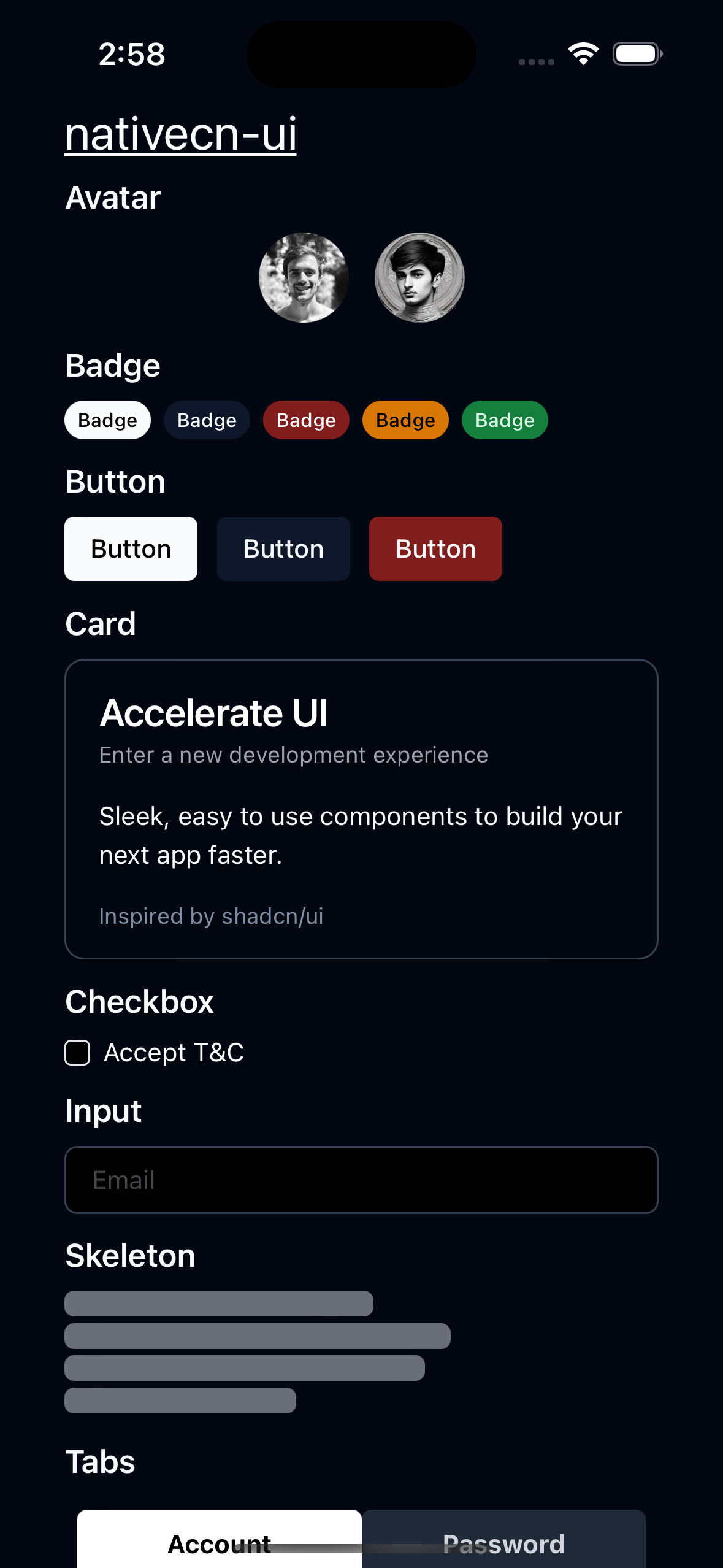
Examples
| Light mode | Dark mode |
|---|---|
 |  |