> ## Documentation Index
> Fetch the complete documentation index at: https://nativecn.mintlify.app/llms.txt
> Use this file to discover all available pages before exploring further.

# Toast

## Overview

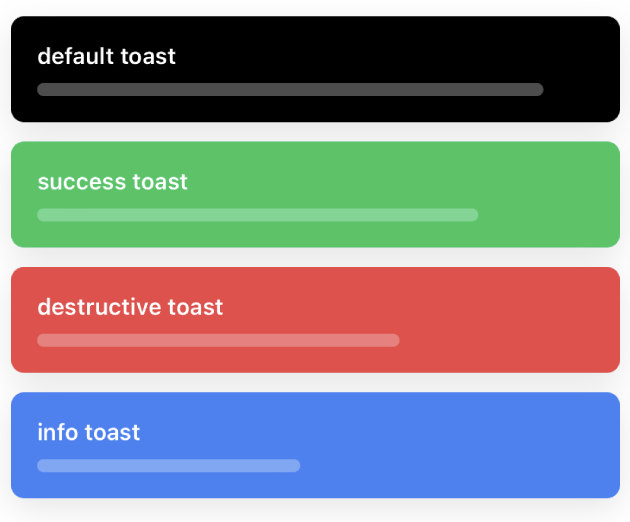
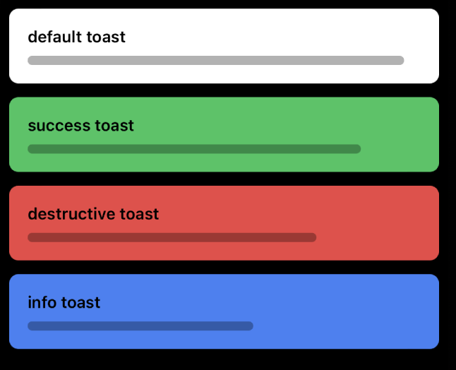
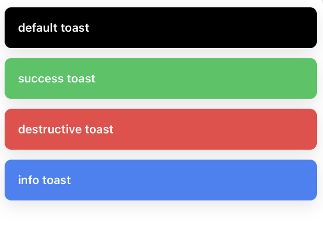
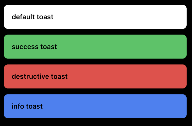
`Toast` is a React Native component designed to provide quick feedback in the form of a temporary, dismissible message. It can be customized based on various variants such as `default`, `success`, `destructive`, and `info`.

## Preview

<Tabs>
  <Tab title="Preview">
    <div>
      <div style={{ display: 'flex', justifyContent: 'center' }}>
        <div style={{ marginRight: '40px' }}>
          <img src="https://raw.githubusercontent.com/Mobilecn-UI/nativecn-ui/main/assets/examples/components/toast-light.png" width="300px" />

          <p>Light Mode</p>
        </div>

        <div>
          <img src="https://raw.githubusercontent.com/Mobilecn-UI/nativecn-ui/main/assets/examples/components/toast-dark.png" width="300px" />

          <p>Dark Mode</p>
        </div>
      </div>

      <div style={{ display: 'flex', justifyContent: 'center' }}>
        <div style={{ marginRight: '40px' }}>
          <img src="https://raw.githubusercontent.com/Mobilecn-UI/nativecn-ui/main/assets/examples/components/toast-light-progress.png" width="300px" />

          <p>Light Mode (with progress)</p>
        </div>

        <div>
          <img src="https://raw.githubusercontent.com/Mobilecn-UI/nativecn-ui/main/assets/examples/components/toast-dark-progress.png" width="300px" />

          <p>Dark Mode (with progress)</p>
        </div>
      </div>
    </div>
  </Tab>

  <Tab title="Code">
    ```jsx theme={null}
    import { ToastProvider, ToastVariant, useToast } from './components/Toast';

    function DemoToast() {
      const { toast } = useToast();

      return (
        <Button
          label="Show Default Toast"
          onPress={() => {
            toast('This is a default toast');
          }}
        />
      );
    }

    // ...

    <ToastProvider position="top">
      <DemoToast />
    </ToastProvider>;
    ```
  </Tab>
</Tabs>

## Installation

<Tabs>
  <Tab title="CLI">
    ```bash theme={null}
    npx nativecn-ui add Toast 
    ```
  </Tab>

  <Tab title="Manual">
    <Steps>
      <Step title="First Step">
        Include [Toast.tsx](https://github.com/Mobilecn-UI/nativecn-ui/blob/main/components/Toast.tsx) in your project.
      </Step>

      <Step title="Second Step">
        Update the import paths to match your project setup.
      </Step>

      <Step title="Third Step">
        Wrap your main component, or the part of your app where you want to use the toast, with the `ToastProvider`
      </Step>

      <Step title="Fourth Step">
        Import and use the `useToast` hook to get access to the `toast` function
      </Step>
    </Steps>
  </Tab>
</Tabs>

## Usage

### Basic usage

```jsx theme={null}
import { ToastProvider, ToastVariant, useToast } from './components/Toast';

function DemoToast() {
  const { toast } = useToast();

  return (
    <Button
      label="Show Default Toast"
      onPress={() => {
        toast('This is a default toast');
      }}
    />
  );
}

<ToastProvider position="top">
  <DemoToast />
</ToastProvider>;
```

### Custom Usage

```jsx theme={null}
// with variant, duration
toast('This is a success toast', 'success', 4000);

// with variant, duration, showProgress
toast('This is a success toast', 'success', 4000, true);
```