> ## Documentation Index
> Fetch the complete documentation index at: https://nativecn.mintlify.site/llms.txt
> Use this file to discover all available pages before exploring further.
# Tabs
## Overview
A set of layered sections of content —known as tab panels— that are displayed one at a time.
## Preview
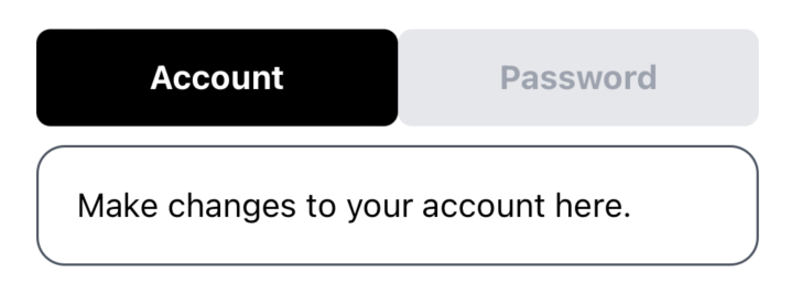
Light mode

Dark mode
```jsx theme={null}
Make changes to your account here.
Change your password here.
```
## Installation
```bash theme={null}
npx nativecn-ui add Tabs
```
Include [Tabs.tsx](https://github.com/Mobilecn-UI/nativecn-ui/blob/main/components/Tabs.tsx) in your project.
Update the import paths to match your project setup.
## Components
### Tabs
The parent container for the tabbing system.
* `defaultValue: string` - The value of the tab that should be active when initially rendered.
* `children` - Components to be rendered inside the Tabs container. Mainly `TabsList` and `TabsContent`.
### TabsList
The container for individual tab triggers.
* `children` - `TabsTrigger` components.
### TabsTrigger
Triggers or buttons for each tab. Should be placed inside `TabsList`.
* `id: string` - A unique identifier for the tab.
* `title: string` - The label displayed on the tab trigger.
### TabsContent
Container for the content of each tab.
* `value: string` - A unique value that associates the content with a trigger.
* `children` - The content to display when the tab is active.
## Usage
### Basic usage
```jsx theme={null}
Make changes to your account here.
Change your password here.
```