> ## Documentation Index
> Fetch the complete documentation index at: https://nativecn.mintlify.app/llms.txt
> Use this file to discover all available pages before exploring further.

# Drop down

## Overview

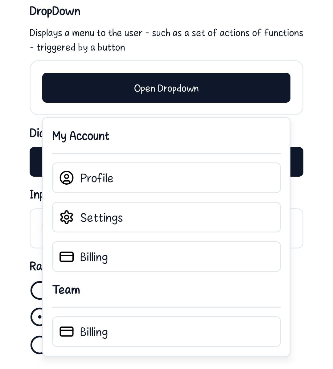
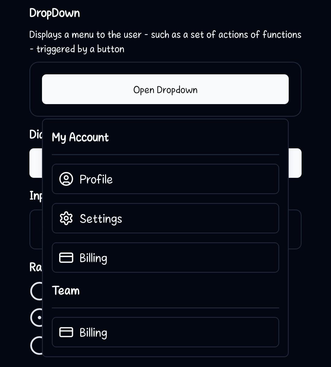
`DropDown` component in React Native is designed to manage drop-downs within your application. The component is split into 6 key parts: `DropDown`, which acts as the context provider containing the other 5 parts; `DropDownTrigger`, handles the action to open and close the dropdown; `DropDownLabel`, this is used to label a section in the dropdown menu; `DropDownContent`, this contains the actual content to be displayed in the dropdown menu; `DropDownItemSeparator` the separator is used to visually separate items in the dropdown menu; `DropDownItem` this component contains the dropdown item to be displayed in the dropdown menu.

## Preview

<Tabs>
  <Tab title="Preview">
    <div style={{ display: 'flex', justifyContent: 'center', gap: '20px' }}>
      <div>
        <img src="https://raw.githubusercontent.com/Mobilecn-UI/nativecn-ui/main/assets/examples/components/dropdown-light.jpg" />

        <p>Light mode</p>
      </div>

      <div>
        <img src="https://raw.githubusercontent.com/Mobilecn-UI/nativecn-ui/main/assets/examples/components/dropdown-dark.jpg" />

        <p>Dark mode</p>
      </div>
    </div>
  </Tab>

  <Tab title="Code">
    ```jsx theme={null}
    <View className="rounded-xl border border-border p-4 z-50">
        <DropDown>
        <DropDownTrigger>
            <Button label="Open Dropdown" />
        </DropDownTrigger>
        <DropDownContent>
            <DropDownLabel labelTitle="My Account" />
            <DropDownItemSeparator />
            <DropDownItem>
            <TouchableOpacity className="flex flex-row gap-2 items-center">
                <CircleUser size={18} color='#000'/>
                <Text className="text-primary text-xl">Profile</Text>
            </TouchableOpacity>
            </DropDownItem>
            <DropDownItem>
            <TouchableOpacity className="flex flex-row gap-2 items-center">
                <Settings size={18} color="#000" />
                <Text className="text-primary text-xl">Settings</Text>
            </TouchableOpacity>
            </DropDownItem>
            <DropDownItem>
            <TouchableOpacity className="flex flex-row gap-2 items-center">
                <CreditCard size={18} color='#000' />
                <Text className="text-primary text-xl">Billing</Text>
            </TouchableOpacity>
            </DropDownItem>
            <DropDownLabel labelTitle="Team" />
            <DropDownItemSeparator />
            <DropDownItem>
            <TouchableOpacity className="flex flex-row gap-2 items-center">
                <CreditCard size={18} color="#000" />
                <Text className="text-primary text-xl">Billing</Text>
            </TouchableOpacity>
            </DropDownItem>
        </DropDownContent>
        </DropDown>
    </View>
    ```
  </Tab>
</Tabs>

## Installation

<Tabs>
  <Tab title="CLI">
    ```bash theme={null}
    npx nativecn-ui add DropDown
    ```
  </Tab>

  <Tab title="Manual">
    <Steps>
      <Step title="First Step">
        Include [DropDown.tsx](https://github.com/Mobilecn-UI/nativecn-ui/blob/main/components/DropDown.tsx) in your project.
      </Step>

      <Step title="Second Step">
        Update the import paths to match your project setup.
      </Step>
    </Steps>
  </Tab>
</Tabs>

## Components

### DropDown

This component is the parent container for the dropdown system.

* `children` - These are the components to be rendered inside the DropDown view. Mainly `DropDownTrigger`, `DropDownLabel`, `DropDownContent`, `DropDownItemSeparator` and `DropDownItem`.

### DropDownTrigger

This component handles the action to open and close the dropdown.

* `children`: The react element that will trigger the dialog to open. It should be a component that accepts an `onPress` prop like a button.

### DropDownContent

This is the body of the DropDown Menu.

* `children` - Components to be rendered inside the `View` element.
* `className?: string` - Tailwind CSS classes to be applied to the `View`

### DropDownLabel

This component accepts the `labelTitle` prop that contains the name/title as the main text shown in the header.

* `labelTitle` - Text to be rendered inside the `DropDownLabel`.

### DropDownItemSeparator

This is a line approximately to the hairLineWidth that will be used to separate different sections in the dropdown menu

### DropDownItem

This component contains the item content that will be added to the dropdown menu.

* `children` - Components to be rendered inside the `View` element.
* `className?: string` - Tailwind CSS classes to be applied to the `View`

## Usage

### Basic Usage

To use the DropDown component, wrap your entire dropdown structure with `DropDown`. Then, use `DropDownTrigger` to specify the element that will open the dropdown, and the `DropDownContent` will now appear when you press on the `DropDownTrigger`. The `DropDownContent` will contain the content of the dropdown ie. `DropDownLabel`, `DropDownItem` and `DropDownItemSeparator`.

```jsx theme={null}
import {
  DropDown,
  DropDownContent,
  DropDownItem,
  DropDownItemSeparator,
  DropDownLabel,
  DropDownTrigger,
} from './components/DropDown';
```

```jsx theme={null}
<DropDown>
    <DropDownTrigger>
        <Button label="Open Dropdown" />
    </DropDownTrigger>
    <DropDownContent>
    <DropDownLabel labelTitle="My Account" />
    <DropDownItemSeparator />
    <DropDownItem>
    <TouchableOpacity className="flex flex-row gap-2 items-center">
        <CircleUser size={18} color='#fff'/>
        <Text className="text-primary text-xl">Profile</Text>
    </TouchableOpacity>
    </DropDownItem>
    <DropDownItem>
    <TouchableOpacity className="flex flex-row gap-2 items-center">
        <Settings size={18} color="#fff" />
        <Text className="text-primary text-xl">Settings</Text>
    </TouchableOpacity>
    </DropDownItem>
    <DropDownItem>
    <TouchableOpacity className="flex flex-row gap-2 items-center">
        <CreditCard size={18} color='#fff' />
        <Text className="text-primary text-xl">Billing</Text>
    </TouchableOpacity>
    </DropDownItem>
    <DropDownLabel labelTitle="Team" />
    <DropDownItemSeparator />
    <DropDownItem>
    <TouchableOpacity className="flex flex-row gap-2 items-center">
        <CreditCard size={18} color="#fff" />
        <Text className="text-primary text-xl">Billing</Text>
    </TouchableOpacity>
    </DropDownItem>
    </DropDownContent>
</DropDown>
```