> ## Documentation Index
> Fetch the complete documentation index at: https://nativecn.mintlify.app/llms.txt
> Use this file to discover all available pages before exploring further.

# Dialog

## Overview

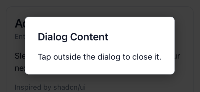
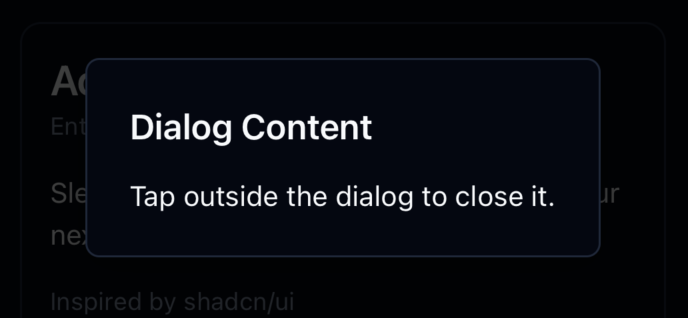
`Dialog` component in React Native is designed to manage modal dialogs within your application. The
component is split into three key parts: `Dialog`, which acts as the context provider; `DialogTrigger`,
which handles the action to open the dialog; and `DialogContent`, which contains the actual content to
be displayed in the dialog.

## Preview

<Tabs>
  <Tab title="Preview">
    <div style={{ display: 'flex', justifyContent: 'center', gap: '20px' }}>
      <div>
        <img src="https://raw.githubusercontent.com/Mobilecn-UI/nativecn-ui/main/assets/examples/components/dialog-light.png" />

        <p>Light mode</p>
      </div>

      <div>
        <img src="https://raw.githubusercontent.com/Mobilecn-UI/nativecn-ui/main/assets/examples/components/dialog-dark.png" />

        <p>Dark mode</p>
      </div>
    </div>
  </Tab>

  <Tab title="Code">
    ```jsx theme={null}
    <View className="flex gap-2">
      <Text className="font-semibold text-xl text-primary">Dialog</Text>
      <Dialog>
        <DialogTrigger>
          <Button label="Open Dialog" />
        </DialogTrigger>
        <DialogContent>
          <View className="flex gap-4">
            <Text className="font-semibold text-xl text-primary">Dialog Content</Text>
            <Text className="text-primary">
              Tap outside the dialog to close it.
            </Text>
          </View>
        </DialogContent>
      </Dialog>
    </View>
    ```
  </Tab>
</Tabs>

## Installation

<Tabs>
  <Tab title="CLI">
    ```bash theme={null}
    npx nativecn-ui add Dialog 
    ```
  </Tab>

  <Tab title="Manual">
    <Steps>
      <Step title="First Step">
        Include [Dialog.tsx](https://github.com/Mobilecn-UI/nativecn-ui/blob/main/components/Dialog.tsx) in your project.
      </Step>

      <Step title="Second Step">
        Update the import paths to match your project setup.
      </Step>
    </Steps>
  </Tab>
</Tabs>

## Properties

### `Dialog`

This component doesn't accept any props directly but acts as a context provider for dialog visibility.

### `DialogTrigger`

* `children`: The React element that will trigger the dialog to open. It should be a component that accepts an `onPress` prop, like a button.

### `DialogContent`

* `children`: The content that will be displayed inside the dialog. This can be any React Node.

## Usage

To use the Dialog component, wrap your entire dialog structure with `Dialog`. Then, use `DialogTrigger` to specify the element that will open the dialog, and `DialogContent` to define the content of the dialog.

```jsx theme={null}
<Dialog>
  <DialogTrigger>
    <Button label="Open Dialog" />
  </DialogTrigger>
  <DialogContent>
    <View className="flex gap-4">
      <Text className="font-semibold text-xl text-primary">Dialog Content</Text>
      <Text className="text-primary">
        Tap outside the dialog to close it.
      </Text>
    </View>
  </DialogContent>
</Dialog>
```