> ## Documentation Index
> Fetch the complete documentation index at: https://nativecn.mintlify.app/llms.txt
> Use this file to discover all available pages before exploring further.

# Checkbox

## Overview

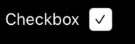
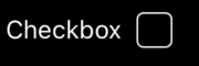
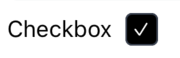
`Checkbox` is a React Native component designed for creating interactive checkboxes with customizable styles. This component allows for easy integration into forms and user interfaces, offering properties for label display and style customization. It leverages Tailwind CSS classes to provide a flexible styling approach suitable for both light and dark themes.

## Preview
<Tabs>
  <Tab title="Preview">
    <div style={{ display: 'flex', justifyContent: 'center' }}>
      <div style={{ marginRight: '40px' }}>
        <img src="https://raw.githubusercontent.com/Mobilecn-UI/nativecn-ui/main/assets/examples/components/checkbox-light-enabled.png" />

        <p>Light mode (Enabled)</p>
      </div>

      <div>
        <img src="https://raw.githubusercontent.com/Mobilecn-UI/nativecn-ui/main/assets/examples/components/checkbox-dark-enabled.png" />

        <p>Dark mode (Enabled)</p>
      </div>
    </div>

    <div style={{ display: 'flex', justifyContent: 'center' }}>
      <div style={{ marginRight: '40px' }}>
        <img src="https://raw.githubusercontent.com/Mobilecn-UI/nativecn-ui/main/assets/examples/components/checkbox-light-disabled.png" />

        <p>Light mode (Disabled)</p>
      </div>

      <div>
        <img src="https://raw.githubusercontent.com/Mobilecn-UI/nativecn-ui/main/assets/examples/components/checkbox-dark-disabled.png" />

        <p>Dark mode (Disabled)</p>
      </div>
    </div>
  </Tab>

  <Tab title="Code">
    ```jsx theme={null}
    <Checkbox label="Accept T&C" />
    ```
  </Tab>
</Tabs>

## Installation

<Tabs>
  <Tab title="CLI">
    ```bash theme={null}
    npx nativecn-ui add Checkbox 
    ```
  </Tab>

  <Tab title="Manual">
    <Steps>
      <Step title="First Step">
        Include [Checkbox.tsx](https://github.com/Mobilecn-UI/nativecn-ui/blob/main/components/Checkbox.tsx) in your project.
      </Step>

      <Step title="Second Step">
        Update the import paths to match your project setup.
      </Step>
    </Steps>
  </Tab>
</Tabs>

## Properties

* `label?: string` (optional) - The label text displayed next to the checkbox.
* `labelClasses?: string` (optional) - Custom classes for styling the label.
* `checkboxClasses?: string` (optional) - Custom classes for styling the checkbox.
* `className?: string` (optional) - Custom classes for the container wrapping the checkbox and its label.

## Usage

```jsx theme={null}
<Checkbox label="Accept Terms" />
```