> ## Documentation Index
> Fetch the complete documentation index at: https://nativecn.mintlify.site/llms.txt
> Use this file to discover all available pages before exploring further.
# Card
## Overview
`Card` is a versatile React Native component that provides a structured format for displaying content.
Cards can display title, description, content, and footer. It also adapts automatically to the current color scheme.
## Preview
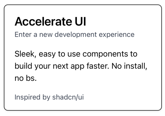
Light mode

Dark mode
```jsx theme={null}
Card
Accelerate UI
Enter a new development experience
Sleek, easy to use components to build your next app faster.
Inspired by shadcn/ui
```
## Installation
```bash theme={null}
npx nativecn-ui add Card
```
Include [Card.tsx](https://github.com/Mobilecn-UI/nativecn-ui/blob/main/components/Card.tsx) in your project.
Update the import paths to match your project setup.
## Components
### Card
The parent container for the card system.
* `children` - Components to be rendered inside the Cards container. Mainly `CardHeader`, `CardContent`, and `CardFooter`.
* `className?: string` - Tailwind CSS classes to be applied to the `View`.
### CardHeader
The container for the card header.
* `children` - Components to be rendered inside the Cards container. Mainly `CardTitle` and `CardDescription`.
* `className?: string` - Tailwind CSS classes to be applied to the `View`.
### CardTitle
The main text shown in the header.
* `children` - Text to be rendered inside the `Text` element.
* `className?: string` - Tailwind CSS classes to be applied to the `Text`.
### CardDescription
The secondary text shown in the header.
* `children` - Text to be rendered inside the `Text` element.
* `className?: string` - Tailwind CSS classes to be applied to the `Text`.
### CardContent
The body of the card.
* `children` - Components to be rendered inside the `View` element.
* `className?: string` - Tailwind CSS classes to be applied to the `View`.
### CardFooter
The footer of the card.
* `children` - Components to be rendered inside the `View` element.
* `className?: string` - Tailwind CSS classes to be applied to the `View`.
### SimpleCard
A pre-built `Card` component taking text as input.
* `className?: string` - Tailwind CSS classes to be applied to the `View`.
* `title?: string` - The title of the card.
* `description?: string` - A brief description or subtitle.
* `content?: string` - The main content inside the card.
* `footer?: string` - Text to display at the bottom of the card.
## Usage
### Basic usage
```jsx theme={null}
Accelerate UI
Enter a new development experience
Sleek, easy to use components to build your next app faster.
Inspired by shadcn/ui
```
### Basic usage with `SimpleCard` component
```jsx theme={null}
```